Category: Graphic Design
Bang On Design
It’s always exciting when someone creates a new packaging or product innovation that changes the face of that category entirely and potentially sets the future of it. One such example is the ‘Dissolve’ prototype toothbrush packaging by Atelier Bang Bang, a Montreal based screen printing workshop and multidisciplinary design studio. It was designed by the company’s founder Simon Laliberté for the ‘Remarkable Packaging & Alternative’ category of the 2012 Packaging Exhibition in Paris where it won 3rd place.
The innovation of the packaging stems from the want to make it 100% recyclable, resulting in a pack that completely dissolves within ten seconds when exposed to water. This is achieved through the use of cellulose based paper and water-soluble soy inks. The design of the packaging itself is relatively simple as the dissolving nature of it means it doesn’t have to be incredibly fancy. Instead, it’s quite stripped back, using just black and white, with the word ‘dissolve’ written across the faces of the slightly futuristic and more complex triangular packaging shape. It’s a really interesting and clever concept that completely revolutionises the toothbrush market and definitely succeeds in its recyclable aims. I believe that it’s this truly revolutionary nature that could allow it to work well in practice if ever taken from prototype to mass production.
Here it is in action;
Redesigning The Dollar
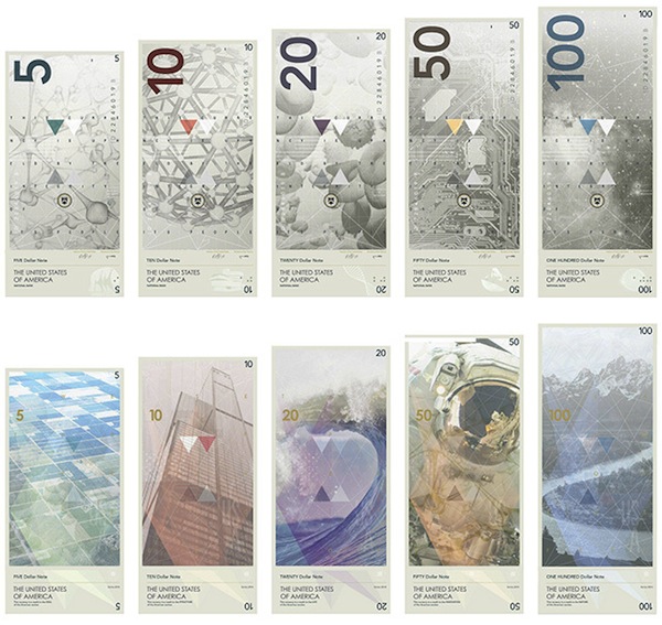
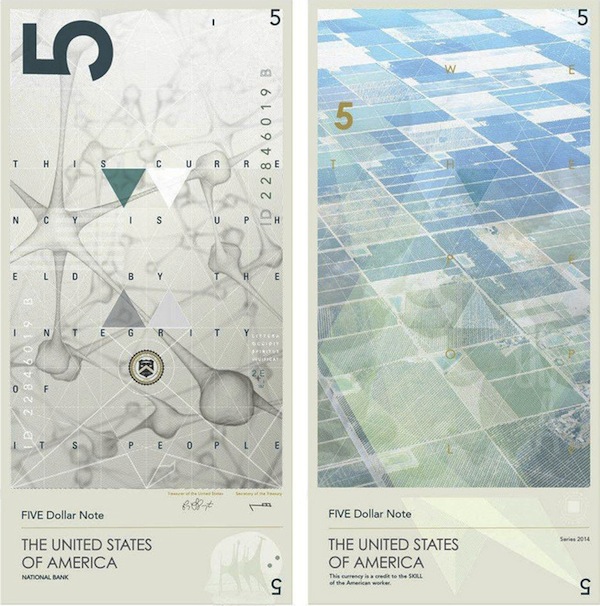
As a graphic designer, one of my favourite things to see is redesigns, especially those that you never thought would get one. This reason alone was why I was instantly interested when I recently came across Travis Purrington‘s proposed redesign of US currency. This theoretical redesign of the range of dollar bills gives them a very modern and unique twist, foregoing any images of founding fathers and instead replacing them with slightly more ambiguous links to American history and landmarks.
I really like the modern feel of the designs and the complete restructuring of all the elements found on the dollar bill. The redesign looks to give a larger variation of colour to the dollar bills, something that makes them, in my opinion, a bit more interesting than the plain green tones seen in the current currency. The one problem with this however, is that by adding these extra colours, it perhaps runs the risk of becoming too similar to other currencies such as the Euro, Pound and Canadian Dollar amongst others.
Realistically, I don’t think anything like this would ever be adopted for US currency. Unfortunately, it’s just perhaps a bit too modern and goes too much against the ideas of history and founding that the present day designs have. It’s a shame, because it’s just so unique and fresh compared to any other currency out there at present.
Found via Design Taxi.
Movieface
One of my final projects from the last year of my university degree involved me taking what is known as ‘sleeveface’ photos of my friends. This was to help make the advertising campaign for a new series of singles nights that I had created for lovers of vinyl records.
The adverts blended record sleeves with actual people, aligning them together to give the impression of one single figure. I then used song lyrics from the artists featured to link back to the idea of a singles night, as if the figure in each of them was saying this line to another attendee. The rest of the project can be found on my website here.
I’m talking about this project because today I came across the work of Malaysia-based Graphic Designer Jaemy Choong. He uses a similar technique to create images, except instead of vinyl record sleeves, he uses movie postcards. He still has the same clever mixture of physical and print, merging people together effortlessly with the figures seen on the cards. It’s a really fun process and its great to see the two elements working together so well. Here are a few of my favourites:
Full credit to him for getting them aligned so perfectly, I know from experience just how difficult it can be to get it to work. You can see more of these pictures on his Instagram here.
Found via Design Taxi.
Film The Blanks
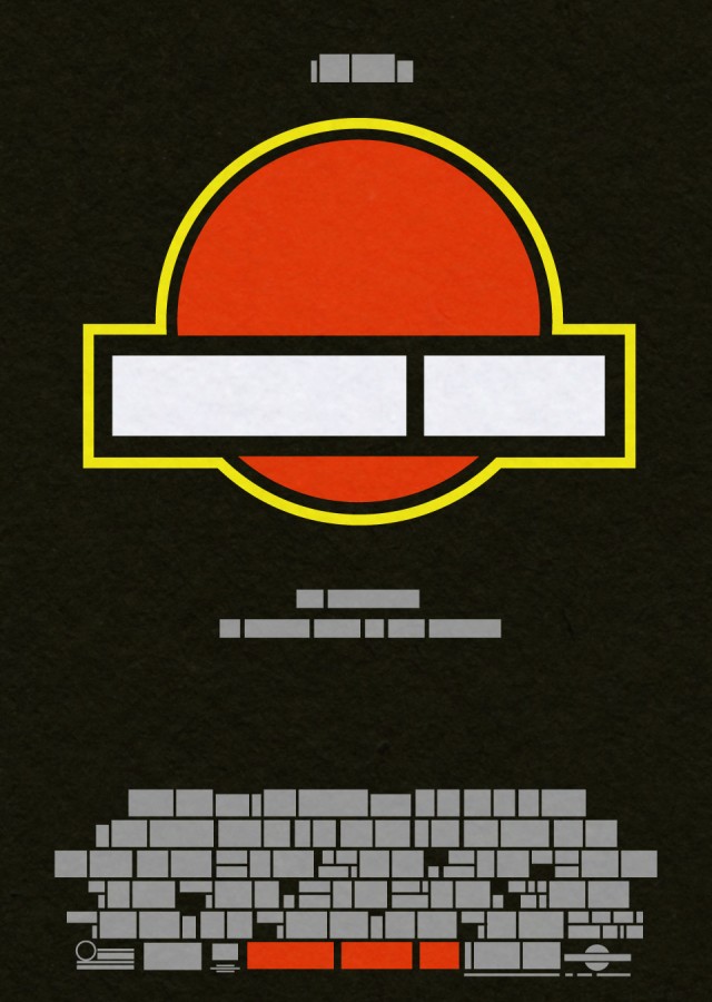
Movie posters nowadays are often saturated with cheesy close-ups of actors or over the top action stills. They are thought of much more as simply commercial marketing rather than pieces of design. However they used to be just as iconic and memorable as the films they promoted, as seen in posters for films like Jurassic Park and Vertigo. So iconic in fact, that designer John Taylor has tested our ability to remember and recognise these images through an experiment he calls Film The Blanks.
By distilling the posters down to their core elements of colours and shapes and taking out anything that would easily identify the films, Taylor has created a series of images that are immediately recognisable as the iconic movie posters they were originally. It’s really interesting how our brains can easily and quickly identify the film, just from a few colours and shapes. It really shows just how iconic these movie posters were, both as promotion for the films, but also as great pieces of design.
The entire collection of abstracted posters can be found here.
Found via Fast Co. Design
A Proper Post
When you spend three years doing something, it can often be difficult to get back into it after you begin to focus your energy elsewhere. It’s not that I’ve turned my focus away from Graphic Design, far from it. It’s the fact that since I finished uni, i’ve spent pretty much the entirety of my time within that world researching and emailing agencies, trying to get placements and internships. As a result my knowledge and connection with the wider world of Graphic Design, especially through this blog, have suffered. I haven’t posted here since June!!
So after around four months of emailing agencies and unfortunately not really getting anywhere with it, I decided to reassess what i’m doing and get stuck in again with design, so that when I eventually get an internship and ultimately a job, i’m not completely out of my depth! Doing this obviously means doing projects and working to deadlines to get back on track with that sort of thing, but more importantly for you reading this, it means getting this blog back on track to help me get back up to date with what’s going on in the world of Graphic Design.
So, now that i’ve probably bored you with what i’ve been doing with my life, it’s time to get back into it. The humble tin of baked beans was first sold in Fortnum and Mason in 1886, then being marketed as a top range American import. Since then it has become much more commonplace and a staple foodstuff, especially for hungry uni students! Design agency Interabang recently gave the simple baked bean a more premium makeover with their branding for the new Proper Beans range of high-end flavoured baked beans.
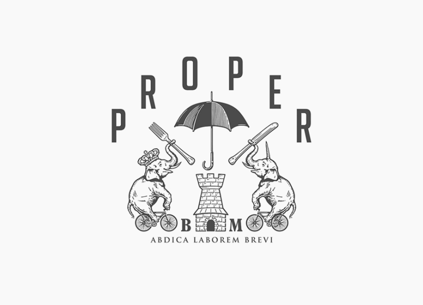
Building on the product uniqueness of fresh flavoured baked beans sold from the chiller cabinet, the standard aluminium tin was gotten rid of, replaced instead with a plastic tub that features a clean and simple pack design. The newly created Proper crest sits as the focal point of the design, pushing the uniqueness of the product even further with its wacky use of an umbrella, oversized cutlery and an elephant/unicorn hybrid. Uniphant perhaps? Elecorn??
The use of the crest is definitely my favourite part of the design. It’s really nicely drawn and gives the product a more premium feel whilst still retaining a playful and quirky edge that is sure to make it stand out amongst competitors. It also works really well with the heritage and history that baked beans have.
So there you have it, my first blog post in four months, but hopefully the first of many in the coming weeks!
Found via The Dieline


