
Tagged: unique
Redesigning The Dollar
As a graphic designer, one of my favourite things to see is redesigns, especially those that you never thought would get one. This reason alone was why I was instantly interested when I recently came across Travis Purrington‘s proposed redesign of US currency. This theoretical redesign of the range of dollar bills gives them a very modern and unique twist, foregoing any images of founding fathers and instead replacing them with slightly more ambiguous links to American history and landmarks.

I really like the modern feel of the designs and the complete restructuring of all the elements found on the dollar bill. The redesign looks to give a larger variation of colour to the dollar bills, something that makes them, in my opinion, a bit more interesting than the plain green tones seen in the current currency. The one problem with this however, is that by adding these extra colours, it perhaps runs the risk of becoming too similar to other currencies such as the Euro, Pound and Canadian Dollar amongst others.


Realistically, I don’t think anything like this would ever be adopted for US currency. Unfortunately, it’s just perhaps a bit too modern and goes too much against the ideas of history and founding that the present day designs have. It’s a shame, because it’s just so unique and fresh compared to any other currency out there at present.
Found via Design Taxi.
A Proper Post
When you spend three years doing something, it can often be difficult to get back into it after you begin to focus your energy elsewhere. It’s not that I’ve turned my focus away from Graphic Design, far from it. It’s the fact that since I finished uni, i’ve spent pretty much the entirety of my time within that world researching and emailing agencies, trying to get placements and internships. As a result my knowledge and connection with the wider world of Graphic Design, especially through this blog, have suffered. I haven’t posted here since June!!
So after around four months of emailing agencies and unfortunately not really getting anywhere with it, I decided to reassess what i’m doing and get stuck in again with design, so that when I eventually get an internship and ultimately a job, i’m not completely out of my depth! Doing this obviously means doing projects and working to deadlines to get back on track with that sort of thing, but more importantly for you reading this, it means getting this blog back on track to help me get back up to date with what’s going on in the world of Graphic Design.
So, now that i’ve probably bored you with what i’ve been doing with my life, it’s time to get back into it. The humble tin of baked beans was first sold in Fortnum and Mason in 1886, then being marketed as a top range American import. Since then it has become much more commonplace and a staple foodstuff, especially for hungry uni students! Design agency Interabang recently gave the simple baked bean a more premium makeover with their branding for the new Proper Beans range of high-end flavoured baked beans.

Building on the product uniqueness of fresh flavoured baked beans sold from the chiller cabinet, the standard aluminium tin was gotten rid of, replaced instead with a plastic tub that features a clean and simple pack design. The newly created Proper crest sits as the focal point of the design, pushing the uniqueness of the product even further with its wacky use of an umbrella, oversized cutlery and an elephant/unicorn hybrid. Uniphant perhaps? Elecorn??

The use of the crest is definitely my favourite part of the design. It’s really nicely drawn and gives the product a more premium feel whilst still retaining a playful and quirky edge that is sure to make it stand out amongst competitors. It also works really well with the heritage and history that baked beans have.
So there you have it, my first blog post in four months, but hopefully the first of many in the coming weeks!
Found via The Dieline
ASS-some Design
First off, excuse the horrific attempt at a pun with this post’s title, it was just something that jumped to mind and I couldn’t shake it! Anyway, as I now come towards the end of my second semester of third year and the business end of my degree at Falmouth, I’m beginning to spend more and more time looking at the work of design agencies, to help identify ones that I might want to send my portfolio to in the hopes of getting a placement.
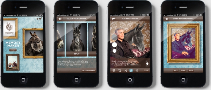
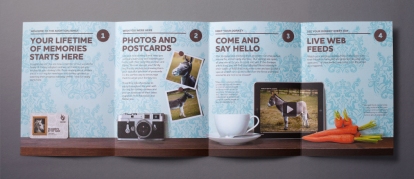
On a recent browse of work, one of the pieces that immediately jumped out at me was The Allotment‘s redesign of the Adoption Scheme for The Donkey Sanctuary. Taking what was a simple piece of editorial design and turning it into something much more emotive and considered, the scheme was given a core concept that clearly set it apart from other competitor products. The big idea was ‘A Lifetime of Memories’, making the donkeys the hero of the product and bringing them into the heart of your family.


Each donkey was professionally photographed, with the adoption pack designed to look like a picture frame in which all the supporting material sat. This allowed it to be its own point of sale pack, immediately intriguing and enticing viewers. Other elements of the redesigned scheme, such as the supporting material and an app which allows you to add donkeys to your own photos were all equally beautifully crafted, but for me it is the frame pack that is the star of the show.

Not only is it really well crafted with great attention to detail, but it is just so unique in its design and the idea behind it. The use of the picture frame really emphasises the ‘part of the family’ concept, putting it a million miles away from the generic design of the sanctuary’s previous adoption pack. Its difference grabs your attention instantly and holds it throughout all aspects of the scheme and pack. It also allows it to sit rather nicely amongst your family photos!


In my opinion it really is a fantastic piece of design and this thought is obviously shared by others as it recently won best product launch at the Marketing Design Awards. For more information on the adoption pack, visit The Allotment’s website here, or watch the below video.
For a studio that have only been around for four years, The Allotment have really become a force in the design world, placing 9th in Design Week’s Creative Survey in 2012, above huge agencies like Pentagram and Johnson Banks. They have become one of my favourite design studios whose work and process really inspires me in my own. When I come to applying for placements in a few weeks time, I’ll definitely be sending The Allotment a copy of my portfolio. Here’s hoping I get a positive response.
1 Year 4 Seasons – A Unique 2014 Calendar
Every year, Bath based design studio Mytton Williams creates a unique and exciting calendar for the upcoming year. I was lucky enough to get a really enjoyable two-week placement at the company back in late April of last year and whilst there, I saw some of their impressive calendar designs from previous years and discussed the plans for the 2014 edition with one of the designers. This got me really excited about the 2014 calendar, which I was lucky enough to recently receive a copy of (apologies for the poor quality photos).
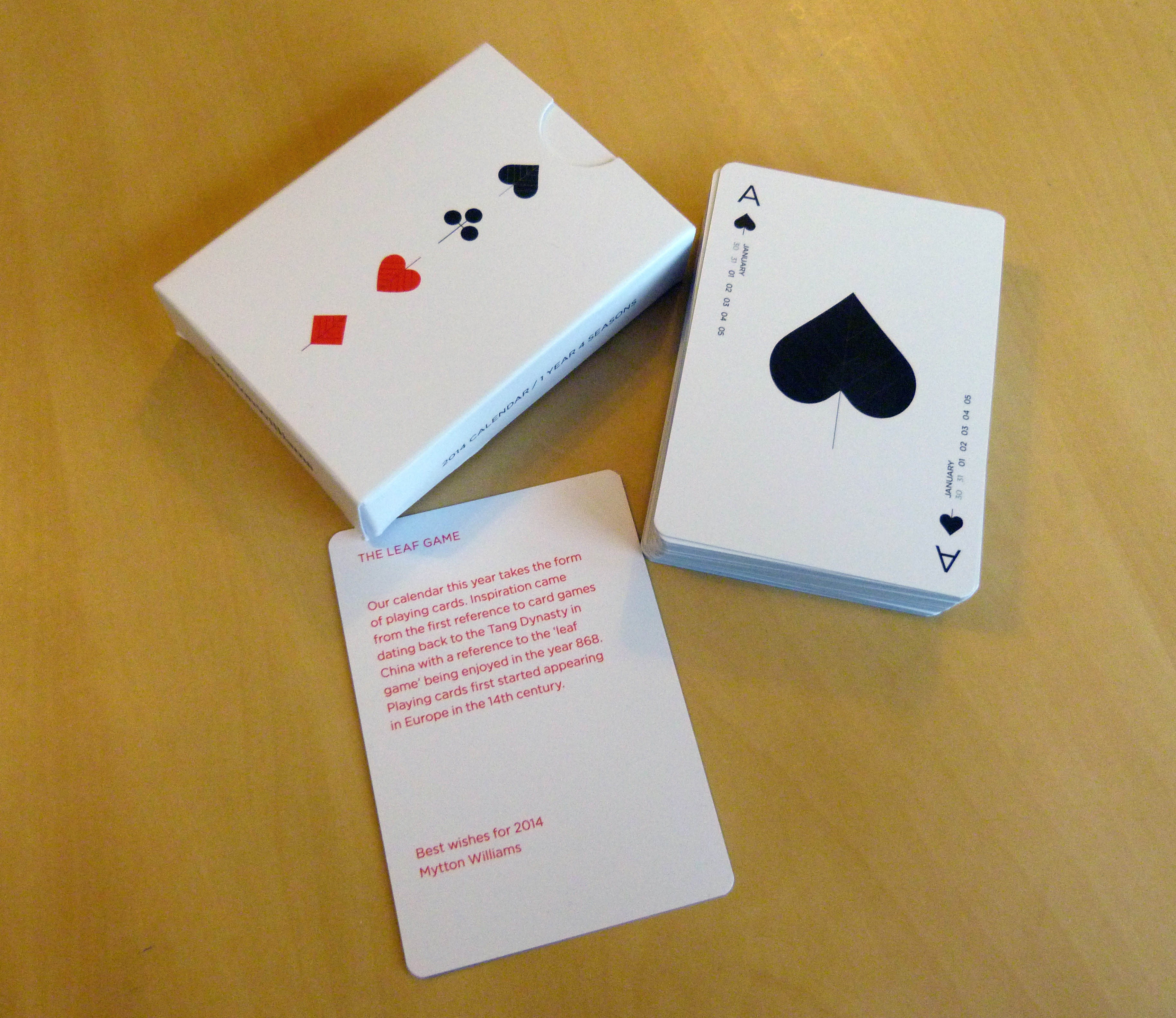
The 2014 calendar takes the unique form of a pack of playing cards and there are many reasons for this being the case. With 52 cards in a pack, each one can neatly cover a week and the four suits give a link to the four seasons. One of the first known card games in the world is the ‘leaf game’ in the Chinese Tang Dynasty in the year 868. This allowed Mytton Williams to use leaves as the visual element on each card, signifying the number of it and further linking back to the four seasons idea.


Each card follows the standard card layout model, with the month and dates being applied on both sides. The centre of the card of course, is where the card number is visualised through the use of suit symbols designed to look like leaves. The ‘leaves’ do not follow a rigid structure though, instead placed sporadically around the card face, as if they were actual leaves blowing in the breeze.
Perhaps the best links though are the ones that create the most simple connections to the year 2014. They may not actually be references and I might just be interpreting them as such, but they are in my mind really clever. Playing cards first appeared in Europe in the 14th Century, which provides a nice numerical link to the year 2014, whilst the side of the card pack says ‘2014 CALENDAR / 1 YEAR 4 SEASONS’, with the 1 and 4 of 2014 neatly splitting to describe one of the main inspirations for the calendars design.

References aside, the 2014 calendar is simply a great, unique piece of design. It is incredibly well crafted and presented and I can’t wait to see what interesting new calendar 2015 brings!
Many thanks to Mytton Williams, both for a fantastic placement last year and also for sending me a copy of the calendar. If you would like your own 2014 calendar, or want to see some better quality images of it, visit their website here.
