Tagged: typography
Charting Musical History
I got a new brief today to rebrand and devise a creative strategy for an art and design materials supplier, which I’m actually quite excited about. I suppose I should be looking at some branding and identity work that is relevant to it, but I saw this and just had to post about it.
As a celebration of their 125 years, Sony Music created a massive typographic timeline that would fill almost 150 square metres of blank wall space at their headquarters. It features some truly awesome type and illustration work by a great designer called Alex Fowkes.
Bubble Wrap Typography
There is a lot of things you can do with bubble wrap; protect presents, packing things, or you can just have fun popping it. But I don’t suppose you’d ever thought of creating typography with it had you? Lo Siento have though, as they’ve done just that, creating bubble wrap typography for the cover of Japanese magazine +81.
Horror Film Festival Posters – My Work
This was the last project I did in my first year at uni. Set the task of designing three typographical posters for a fictional horror film festival I created Fearstifal, a horror film festival in Falmouth, and came up with the idea of using a glow-in-the-dark hidden message on each of the posters.
The three posters were based on three different elements of films; film titles, quotes and directors. Each poster contained a list of items relating to its theme in a recurring style that was a very subtle link to reels of film.
Art Foundation Final Major Project – My Work
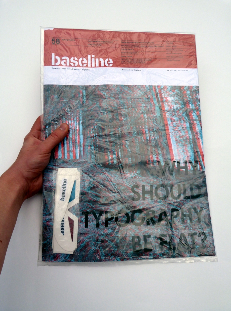
My final major project on my Art Foundation course shared similarities with the Baseline Magazine project I looked at in the last post. I went into the project wanting to create a book as it was something I hadn’t done before and so came up with a brief to explore and question the use of typography through the use of books.
I produced three books as my final piece which were exhibited below three pieces of text as seen below. Each book contained a collection of screen-printed quotes and definitions which described what had been done to each book and were obscured or altered in some way.
Baseline Magazine – My Work
To start this week of posts I’m going to talk about one of my favourite projects that I did during Art Foundation last year. For it I produced two fictional designs for the front cover of a possible future issue of Baseline Magazine.
We were tasked with creating a theme for the issue before designing the cover so I chose to look into typography and question why it should be produced in conventional ways.


